
There doesn't seem to be much info out there on the art of making custom graphics for DooM wads. Most of what I know I've had to learn the hard way. I've documented it here in hopes of saving others the time of trial and error that I had to go through. I can't say I've mastered this art, and I don't claim to be an expert on the subject. But I'm willing to share what I've learned in hopes of helping the DooM community improve its image(s).
Ever wonder why there are so many DooM TCs and PCs out there with mediocre to just-plain-awful custom graphics? Here's why making new graphics for DooM is not as easy at it might seem:
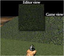 DooM renders many colors brighter and bolder.
The DooM engine seems to use a Mac style gamma curve. That makes graphics look better. On my Windows computer, I have to ramp the monitor brightness all the way to 100 (normally at 18) AND set Photoshop's Working RGB to Mac to get the colors in the ballpark of what they'll look like in the game. Even that's not enough, and I frequently get nasty surprises anyway, but it helps.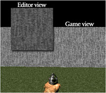 DooM renders patterns in unexpected ways.
The DooM engine is a wonderfully strange device. Sometimes it seems to diffuse patterns, making certain kinds of detail hard to notice. Sometimes it seems to enhance patterns, making them call attention to themselves when you hadn't even noticed them in your graphics program. Sometimes that's only due to seeing it tiled, sometimes it's not.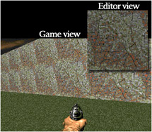 Tiling well can be hell on earth.
Making graphics tile well is difficult under the best circumstances. Tiling them well in an engine that renders height on a curve can be flabbergasting. The difference between a pattern that calls attention to itself and one that doesn't is more art than science. There seems to be no accounting for it. You never know till you try it in the game.- Unalterable 8-bit color pallette.
You've only got 256 colors to work with, and they've been chosen for you. If you need peach, teal, or violet - sorry, you're out of luck. Of course, if you need peach, teal, or violet, you're designing for the wrong game! 8-) But sometimes a graphic will look really cool until you convert it to the DooM pallet. Learning how different color combinations will convert takes lots of experimentation. 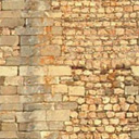
24-bit RGB color

8-bit DooM color
 Chaos from order.
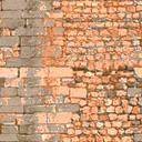
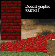
Any kind of close, straight line pattern will alias like mad, especially if it's horizontal. Ever notice that the bars, pipes, and brick lines in most DooM factory textures are kind of far apart? That's to cut down on that annoying alias effect. Sometimes you can cause it without realizing it until you see it rendered by the engine. Getting rid of it without destroying the essential look of the texture can try your patience most sorely. For textures like strong, clean brick walls, it's simply unavoidable, as evidenced by this factory texture from DooM 2.
Hints & Tips
- Match your graphics work environment to the engine's rendering as closely as possible. Build a few textures and test them in the game. Compare what they look like in the game to how they look in your graphics program. Do whatever it takes to be able to view them while you work on them similarly to the way they will look in the game. There will always be enough variables to keep you guessing; minimize them wherever possible.
- Study the factory graphics. Scrutinize them in and out of the game. Most of them are very good, many are excellent, expecially the Ultimate DooM set. They are surprisingly difficult to match or beat in quality, utility, and mutual compatibility. Note carefully how they are laid out and what is similar between them. Use them as reference points to make sure yours are not too light (or too dark—but that's less likely), and that they fit the style (unless you're doing a TC).
- Once you have your basic look on a texture or flat, defile it. If it's wood, scratch and/or splinter it. If it's metal, rust it; make rust run from rivets and screws. If it's likely to be used near slime, slime it. If it's cement or stone, pock mark it, crack it, grow moss on it. The worlds of DooM, whether Phobos, Earth, or elsewhere, are places that have been damaged and corrupted by conflict and evil. Nearly all of the original DooM graphics reflect that condition. Textures, flats, and items alike are weathered, rusting, cracked, stained, scratched, clawed, pock-marked, overgrown, rotting, intermittent, emblazoned with a Hellish insignia; oozing, leaking, spewing, or filled with noxious liquid; burning, dying or dead, or some combination thereof. They are worlds infected, polluted, and corrupted; worlds in decay. If your textures look too clean and pretty, they won't fit the game, except in certain cases such as a few computerish textures, door jams, keys, etc.
- Think mood and emotional impact. As difficult as it is to get a texture to look "real" and believable, if it doesn't also make the player feel right, it won't be a good DooM texture. It should look brooding, menacing, or even sickening. It should inspire fear, a sense that things are not quite right, a sense of danger, dread, the willies - any mood appropriate to DooM. When you've succeeded at making the texture you were picturing in your mind, and it looks natural and believable, it's easy to forget to notice whether it looks too friendly, pretty, or nice.
- Unless your graphics are going to be used in a TC, make them match the original graphics. Test them in real wads where they are used in conjunction with the originals and make sure they don't look out of place. Sometimes that means making the colors stronger or paler, sometimes it means using fewer colors prominently. Sometimes it means making them less busy.
Orlando, FL, USA
Latest update 29 Sept 2005.